MBA + M.S. Human Factors in Info Design
Usability Testing
Museum of WWII Website Redesign
This was a multiple client project. My team worked with people from the museum and people from the company that was in the process of redesigning the website. This created challenges for coordinating meetings across all of the groups involved with this project.
One of my team members for this project was based in California. This gave me an opportunity to understand the challenges imposed on distributed teams. Working across time zones was an interesting experience.
The Team
Tina Chou
Justin Siris
Aradhika Guleria
Lauren Stern
Andrew Person

The site we tested:
Project Goals
-
The Museum of WWII in Natick, MA has transitioned from a private enterprise to a public non-profit organization. They are moving into a larger space and wanted to update their website to reflect their new status and encourage new visitors to the museum. The new website needs to support potential visitors, researchers, donors, and accurately express the new tone of the museum as a public education venue.
-
My team conducted a usability test to assess the problems with the current website in order to help inform the design of the new website.
-
We chose to focus on the “potential visitor” group because this is the largest market and we had access to people who fit this description.
Initial Client Meeting
We met with the client to get a sense of the direction they wanted the project to move in. They informed us about what users they wanted to target, goals for the new website, and their basic timeline for the completion of the project. They made a static version of the website available to us so that any changes they made to the live version would not affect our study.
Expert Review
Each member of the team conducted a Heuristic/expert review of the museum’s website. We used the Neilson Heuristics and severity scales to determine what a usability problem was and how important that problem was. When conducting the review, I looked through the website for general problems with the content and the design. Then I took a second pass at the website with the “new potential visitor” in mind. After completing the individual review all of the team members uploaded their spreadsheets to our shared folder. We created a shared document and the findings were compiled into a single list. We used an excel spread sheet to do this.
Test Plan
The Heuristic review gave us a starting point to work from in order to develop our test plan for the usability test.
Test plan included the following elements
-
Problem statement
-
Purpose of study
-
Scope of study
-
Special concerns
-
-
Participants
-
Characteristics
-
People who would potentially visit the museum
-
-
Recruitment plan
-
Recruited participants from a historical dance company
-
-
Screener
-
Consent form
-
Compensation
-
-
Tasks
-
Measures collected
-
Recordings
-
UMUX (4 questions with a 7 point scale) and Product Reaction Cards (Microsoft).
-
-
Test procedure
-
Where, when, how?
-
-
Analysis plan
-
Look to see what tasks the users completed and those where they had problems
-
-
Required equipment
-
Sponsor requirements/dependencies
-
Analysis plan
-
Deliverables
-
Schedule
Tasks
One of my jobs for this project was to develop the task list. I did this through a combination of considering the test goals, client goals and the problems that the team agreed on during the expert review phase of the project. The areas of focus were site navigation, planning a visit to the museum, contacting the museum, and donating to the museum.
Scenarios were created for each task to help the participant get into the headspace of the question being asked of them.
5 areas of focus
-
Find information for visiting the museum
-
Discover the current special exhibits on display
-
Research WWII resistance movements from the museum’s collection
-
Find out how to contribute to the museum
-
Determine whether the museum has wheelchair accessibility
Moderated and Unmoderated Sessions
We conducted 10 moderated 60-minute sessions during this study. 9 participants were run online through “go to meeting” and one was in person in the user experience center at Bentley University. I moderated one online and the in-person session. For all of the other sessions I served as a note taker.
We also conducted 15 unmoderated sessions through usertesting.com. I set up the screener to select people who were interested in history and would visit a museum. Then selected 5 tasks based on the tasks from our moderated sessions. Post test questions were also given to the participants. These questions were a combination of multiple choice likert scale questions and 4 direct questions. The post test questions focused on ease of use, pain points, likes, dislikes, possible improvements, and overall impression.
Pilot test
Before we conducted the test, we ran a pilot session. This enabled us to reduce the risk that the questions and tasks in our mod guide are misinterpreted by participants. Additionally, the pilot test also helped us to work out the technological challenges associated with running the test online. This helped us build a stronger protocol for explaining to our participants how to load "Go to Meeting" and share their screen.
Analysis
We analyzed the data to identify both the larger (global) trends, as well as the detailed (local) usability issues that had a significant impact on the user experience. Results were be broken down based on the user task, as outlined in the moderator guide. The team tabulated the number of participants that were successful at each task and evaluated whether there were any patterns in how tasks were accomplished. This was facilitated the template that each note taker used, when taking notes during the session, so that results can be easily compared. Based on each individual’s observation, severity ratings were scored independently of each other and then combined to evaluate any similarities or differences among team members. The team discussed and prioritized the most severe usability problems and compiled them for presentation to the client.
Unmoderated and moderated were compared separately. The reason for this is that they had different test designs. The unmoderated sessions had a more limited set of questions due to the time constraints imposed by the testing platform. This prevented us from asking the exact same questions in this aspect of the study.
Conducting moderated and unmoderated gave us more insight into whether the usability problems encountered by the participants where common across participants or isolated to a particular individual.
Severity Scale


Critical
Results
High Ratio of Text to Whitespace
Critical
Large unformatted blocks of text conceal crucial information
“It’s really wordy… very hard to read and you can’t easily grab the most pertinent pieces of information.” (P9)
“That is a lot of words… not going to read all of the text.” (UT14)
Recommendations:
-
Divide text into smaller sections with clear headers
-
Consider adding bullet points for list information
-
Call out key points with visual cues
-
Global search

Unclear Information Architecture

Issue
Information is grouped and organized in unexpected ways
“Feels as if someone just put a lot of informative text in there but forgot to organize it.” (P8)
“There was no straightforward way to find information. I had to guess which sections had the information I needed.” (UT9)
Recommendations:
-
Gather all the relevant information into one section about the museum
-
Evolve the “Speakers” section to include future events and programs
-
Divide the “Questions” page into sections

Misleading Hyperlink Behavior
Issue
Page heading hyperlinks lead to the same page, not a new page
All users expected that clicking on a hyperlink would take them to a new page.
Recommendation:
-
Remove hyperlinks from page heading titles

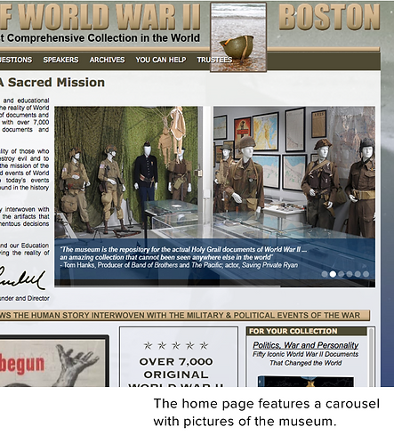
Pictures Give a Sense of the Museum

Positive
Website photos showed the breadth and depth of the exhibits on display
“Love the video and the slide-reel.” (UT14)
“I liked all the pictures of the exhibits.” (UT2)
“That is an awesome tank! Look at that equipment, I like how they have pictures.” (UT13)
Scrolling Behavior Unexpected for Upcoming Events Widget
Issue
Participants expected the home page would show events but were confused by the selective scrolling for the current exhibits widget.
“I would not have known that was a thing you could do in a box on a website. I wouldn’t read that necessarily…” (P9)
Recommendation:
-
Change the carousel images on the homepage into upcoming event images with supporting text and links for more information

Museum’s Authenticity Conveyed
Positive
Founder’s statement provided authority to the museum. Highlighting artifact preservation efforts also gave a positive impression of the museum.
“Good to know it’s the most comprehensive in the world… it’s meant to save and preserve these objects.” (UT6)
Recommendation:
-
Some users overlooked this section. It may be useful to highlight the museum’s knowledge and authority of this historical era to attract potential visitors.

Important Information Not Prioritized
Critical
Crucial information is not prioritized, so users had to read the entire page when searching for information
“Dense content and address is buried in….. I would want to see address, phone, email called out.” (P2)
“It seems like a giant wall of text. I want to be able to find the information I need quickly.” (P3)
Recommendation:
-
Prioritize the most important visiting information in a visually distinct manner
-
Divide text into smaller sections with clear headers

Unexpected Waiver Form
Issue
Some participants did not expect that a waiver form is required to visit the museum.
“It should be something you can do online.” (P6)
“Seems like a tough place to visit.” (P4)
“Would prefer to... send them electronically.” (P8)
Recommendation:
-
Make the waiver form information more prominent.
-
Create an e-form that can be sent electronically to the museum.

Appointment-Only Visit information Unclear
Issue
Several of the unmoderated participants did not realize they needed to schedule an appointment in order to visit the museum.
“Okay, So I can see that you can schedule a visit. But what if I want to drop in?” UT10
Recommendation:
-
Make the appointment instructions more prominent

Contact Information Not Prominent
Issue
Many participants searched for a phone number in the navigation bars.
“I can see email address in multiple places but cannot find a phone number.” (P4)
“Contact information should be clearer/easier to find, make it more clear that drop-in visits cannot be accommodated.” (P7)
Recommendation:
-
Include contact information in the top navigation or the footer where the information is easily accessible
-
Add a phone number

Address of the Museum
Issue
Most participants said they did not need step-by-step directions to the museum and would have just preferred finding the address.
“What I would find important is that the address is mentioned properly so that I can put that in my Google Maps.” (P8)
Recommendation:
-
Potentially remove step-by-step directions from the page.
-
Link directly to Google Maps

Useful Informative Text
Positive
Despite the large amount of visible text, many participants found the information that was displayed useful. However, they wanted a clearer way to process the information.

Definition of “Virtual Tour” Varies
Critical
Some users do not think a virtual tour is a place to find details about items in the collection. Some users went to the Archives or Questions page instead to find specific information.
“When I think of a virtual tour, I’m not thinking of detailed information…” (UT2)
Recommendation:
-
Rename the “Virtual Tour” section to “Collections”
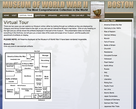
Floor Plan Does Not Appear to be Interactive
Issue
Many users did not think the layout image contained hyperlinks to other pages.
“I didn’t recognize all the things together in one large room as individual buttons… it’s hard to tell where I should be clicking.” (P7)
Recommendation:
-
Make the floor plan image larger.
-
Add hover effects showing images from the collections enabling users to preview the types of artifacts in the collection in one place.

Inconsistent Interactivity of Floor Plan Image
Issue
Some users were confused when they clicked on Archives but nothing happened.
"It looks like the Archives section is not clickable. It's frustrating especially since it is right in the middle of the map." (UT3)
Recommendation:
-
Make Archives click through to the Archives page.
-
Remove non clickable text from floor plan image

Virtual Tour Contains Wealth of Information
Positive
Detailed photos and information accompany each section of the virtual tour.
"That’s more information than I was expecting." (UT1)

Donation Images Ignored as Ads
Critical
Most did not click on the “Save The Reality” or “We want to be part of the expansion” images. Users instead read the information in the main text.
“I would recommend making these Donate links on the right way more obvious… I thought all of these boxes were ads… so I completely ignored all of them.” (UT14)
Recommendation:
-
Streamline/standardize the donation links
-
Remove repetitive content
-
Clearly feature PayPal button as part of the page itself

Donation Box Somewhat Hidden
Issue
Users that discovered it did so because they read the text on the left first. Most recognized the donate button was for PayPal.
“I would probably come here and give them a PayPal since that’s easier than writing a check.” (P3)
Recommendation:
-
Standardize terminology and avoid referring to the section as a “donation box”
-
Display PayPal button more prominently on the page

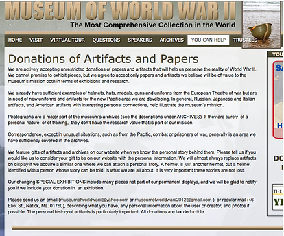
Clear Artifact Donation Policy
Positive
Participants could easily find the policy and read the details.
“It tells you right there, send an email” (P5)
“So yeah, depending on what it is, they need... artifacts from the Pacific area… They don’t want photographs or correspondence. They have contact information.” (P10)